Meet our brand typefaces.
Source Sans 3
We use source sans 3 mainly in headers, subheaders or short paragraphs often accompanied with an image. Source sans 3 is a versatile typeface with a wide range in terms of tone and playfulness. It can set the mood as a header, or relay important technical data or instructions when the situation calls for it.
Source sans 3 comes in 6 different weights along with an italic option for each.

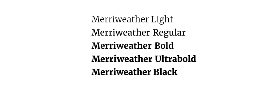
Merriweather
Merriweather is optimized for readability at smaller sizes and in larger quantities. Its mainly used in areas where there’s a lot of it such as body text. Its also the weapon of choice when it comes to quotes or highlighted text paragraphs such as preamble text.
Merriweather comes in 5 different weights along with an italic option for each.
Both 'Source Sans 3' & 'Merriweather' supports Latin (Swedish, English, French etc) as well Cyrillic (for example Russian). This provides unity across all countries and markets.

Typography colours
We mostly use black or white for typography but will make exceptions here and there - mostly for campaigns and interactive elements.
See colours or colour usage for more information.

Typography size guide
This is an example in sizes, this can vary depending on the scenario and the application. This is the baseline from which we start our projects. There is room for adjustments, just dont stray to far from base.
Header
Font: Source Sans 3
Recommended properties for print:
Font size: 40pkt
Spacing: 44pkt
Font weight: Black
Recommended properties for digital:
Font size:
Spacing:
Font weight:
Body
Font: Merriweather
Recommended properties for print:
Font size: 7,75pkt
Spacing: 13,2pkt
Font weight: Light
Recommended properties for digital:
Font size:
Spacing:
Font weight:
Subheader
Font: Source Sans 3
Recommended properties for print:
Font size: 12pkt
Spacing: 14,5pkt
Font weight: Black
Recommended properties for digital:
Font size:
Spacing:
Font weight:
Preamble/Quotes
Font: Merriweather
Recommended properties for print:
Font size: 11,5pkt
Spacing: 17,3pkt
Font weight: Light Italic
Recommended properties for print:
Font size:
Spacing:
Font weight:
For readability, always use regular weight when text is on an image.
Downloads

Above you see an example, click the link below to preview the full brochure. Here you can see how the different typography can be used. In different paragraphs with the right margins and a suitable size and style.